Design Process
Home
My name is Nala E. Widjaja and I received my master degree from Communication & Development Studies, Ohio University. I created this data visualization site with the guidance of my Professor Juan Thomassie. The idea for this website came when I wrote a paper titled “Blaming the Victim: Stigmatization on YouTube Comments Related to Opioid Addiction” for my capstone project. For this project, I collected comments from a YouTube video and performed text, thematic, and sentiment analysis to analyze people's opinions toward opioid addiction. When I was writing for that paper, I faced a challenge on how to visualize the drug overdose mortality rate in the United States. This challenge motivated me to create a data visualization site on drug overdose data in the U.S. Below are the steps that I took in creating this site:
01 Data Gathering and Cleaning
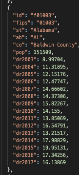
The data for drug overdose mortality rates can be obtained from the Center for Disease Control and Prevention (CDC).The data on CDC is on the CSV format, therefore, we have to convert it to the JSON format. Afterward, we needed to restructure so it would be suitable for the map. we can use Lodash to group the data based on county. The Snipped below shows the JSON data structure after I regrouped it by using Lodash:
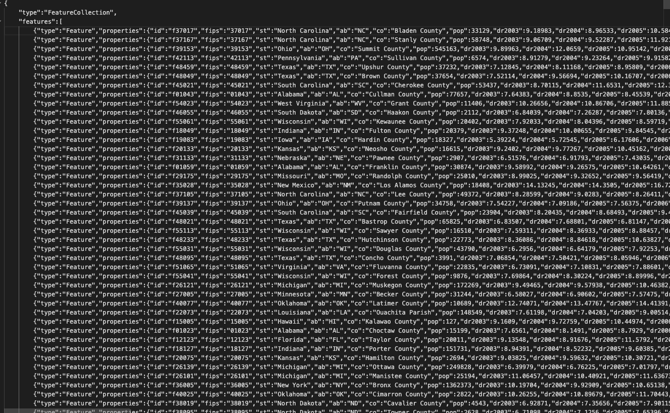
After that, we need to ‘tie’ this JSON data to the US map picture. For that, we need to obtain the shapefile of the U.S map and then joined it with the JSON data that we already built. The shapefile for the U.S map can be obtained from the Census Bureau site. I use Lodash to join the U.S map data and the JSON data for this project. As an alternative, we can use QGIS for this proses. The result of this proses is a GeoJSON file that contains the data of the drug overdose and the shapefile of the U.S data. The snipped below shows the GeoJson file for this project:
02 Data visualization in Mapbox
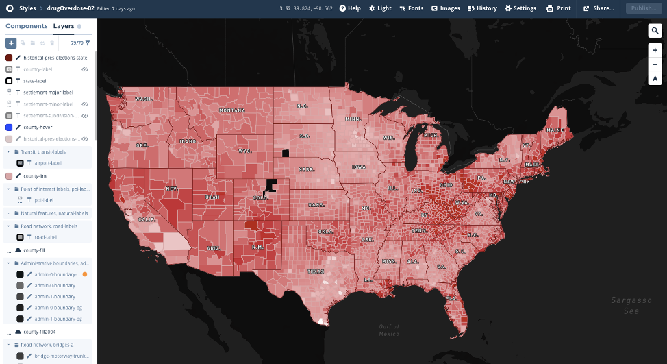
The second step in making this data visualization was to style the map based on the GeoJSON data that we created in the first step. For that, I used Mapbox to style the map for this project. Mapbox offers flexibility to customize the map based on the types of data that we have. Below is the Mapbox styling for this data:
03 Put the visualization on the web
The last step was to put the map on the website. I used HTML, CSS, Bootstrap, and Javascript
to build it. I also use chart.js to add an interactive chart, to show the death rate based
on drug overdose by year.